UI/UX Design • Tools Engineering • Automation • Prototyping
Throughout the development of Destiny 2, I split my time between UI design and programming for tools and automation. I created several tools to aid in internal development processes, including test automation for UI, Localization, and Sandbox QA teams, as well as streamlining of the tools used by all developers and testers in the studio to subscribe and manage their branch mappings and project settings. I also helped to create a tool which would convert old UI content to the new schema system after a tools upgrade and aided in the development of the new UI editor tool to be used on subsequent releases.
Vault
For Destiny 2 I worked to revamp the Vault screens for both a visual refresh and added functionality over that seen in the original Destiny. I implemented pagination so the player could have increased storage capacity as well as sorting functionality to make items easier to find within the vault. We implemented new animations and layout, while keeping to the art standards set by the previous iterations.
Tank & Weapon HUD
I built and implemented animations for the missile HUD display for the new Guardian Tank vehicle and assisted with the expandable reticle and targeting UI, as well as the reticle for the new Bow weapon archetype. Each vehicle and weapon type in the Destiny franchise has a unique look and feel to the UI, but the tank and bow had new functionality that needed to be communicated to the player — lock-on and draw states. I worked alongside sandbox design as well as visual and other UI designers to create the new animations and behaviors which made the new weapons feel unique while being easily understood and familiar to players.
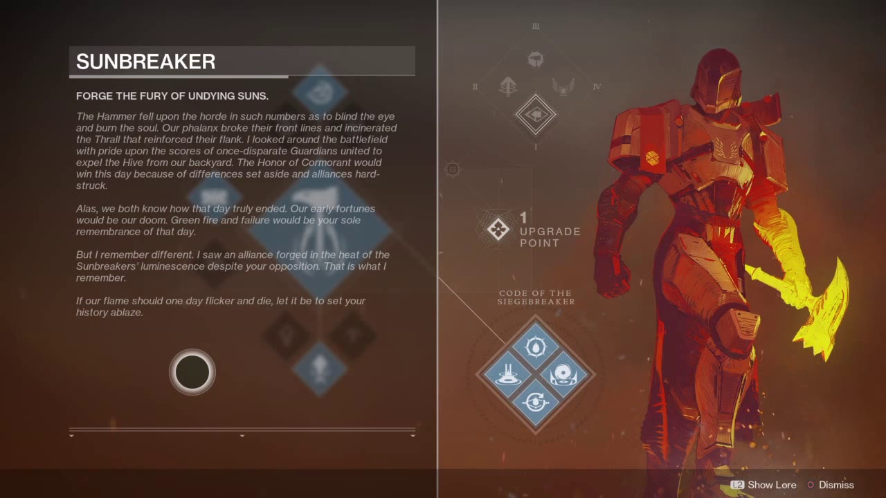
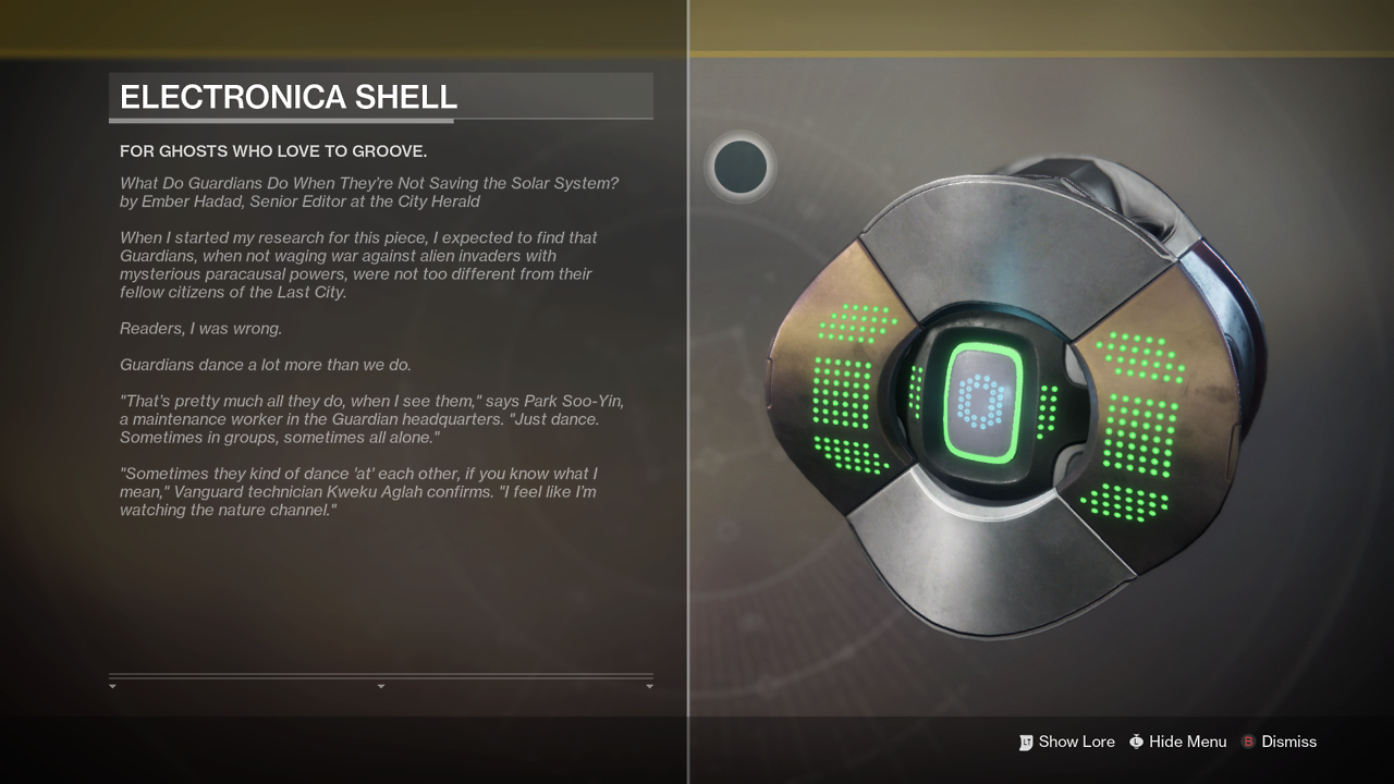
Lore Panel
In Destiny 2 I built the expandable lore panel on item details screens, which provided an in-game space for additional narrative outside of the main campaign missions —narrative which was previously relegated to the Grimoire on the BNet website and not discoverable for the average player. We needed to provide an area for this display, while always allowing weapon and character art to be visible and interactable. I implemented a slide-out panel which would never obscure the art, but would take cursor focus while still allowing camera manipulation. The screen allows for a scroll bar as well, to accommodate long strings and localization, which gave our writers much more freedom than they had for previous narrative blurbs on classes and weapons, while still keeping the visuals of the panel consistent.


